


Introduction
Have you ever devoted an awful lot of time to your screen in perfecting a design, selecting colors that were beautiful and bright, but when you find the final print, you have this sense of disappointment? The electric blue shades to a dull navy; the animated lime green to dull olive. In case you experience this feeling, you are not the first one. And this is a rather irritating discrepancy between what you observe on your monitor screen and what you obtain on paper, the most typical dilemmas of the world of layouts and printing.
It is not a malfunctioning printer or an ill file. It is a core distinction in the ways screens make color and printers do. The two types of color language are the RGB system and CMYK, and it is these two that dictate this journey into the physical world of ink, a transition that, as we have seen, takes the digital world of pixels and brings it into the physical world of ink.
The major way of closing this gap is to understand the color system behind printing. With traditional print, the printing trade is based on CMYK —a subtractive color model, using the four basic inks (cyan, magenta, yellow, and black) that can be applied to render a large palette of colors on paper. This is very different from the additive RGB, which is employed in screens to produce colors by combining red, green, and blue light.
This is an all-encompassing guide in which we shall be demystifying the process. We will trace what CMYK printing is, why it is a norm in the printing industry for all tangible media, but very different compared to the RGB color you can see on the screen. We are going to give you practical steps to the correct preparation of your files, examine some professional practices such as producing or making a rich black, and last of all, how important high-quality consumables are to the achievement of the perfect print. You will find yourself at the end of it not only full of confidence, but also equipped with the knowledge that can make sure that your vision transreflects from screen to paper, flawlessly, each time.
What is CMYK Printing?
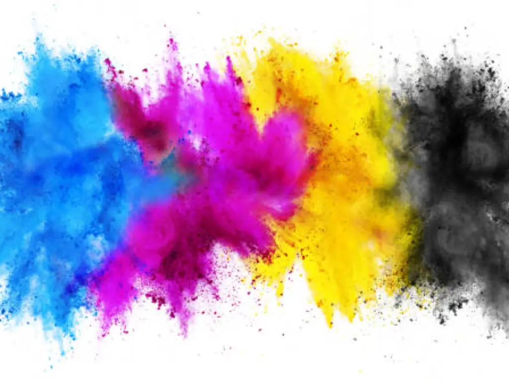
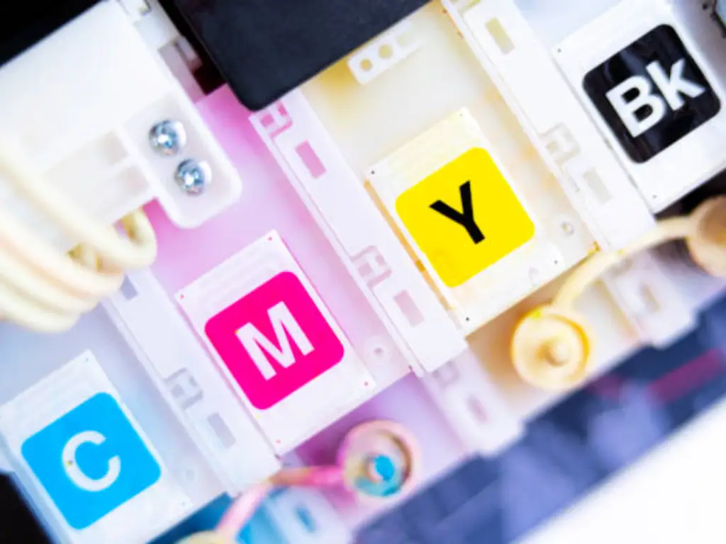
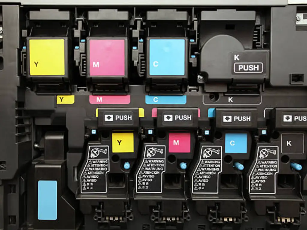
At its core, CMYK is the standard color model used in the vast majority of commercial and home printing processes and is the industry standard. The acronym stands for the four colors of ink used: Cyan, Magenta, Yellow, and Key.
And maybe you will ask, Why Key and not Black? As it happens, the K does refer to black, but it is known as the key color because (in the olden days) the black weight had been known as the key plate used to line up all the other color plates, as well as providing the fine details and black and white contrasts to the final picture.
CMYK printing also consists of applying or depositing microscopic dots of each of these four inks in assorted designs and dimensions on a material that is commonly white paper. At a distance, however, the human eye unites these dot patterns and sees a full spectrum of colors. It is as though it were a microscopic mosaic. One green ink does not form a field of green; instead, an exact combination of cyan and yellow ink dots does the job. This process is also called full-color printing or four-color process because it is the driving force behind every brochure, magazine, family photo, and product packaging.
This model is called a subtractive color model. Actually, even the name itself hints at the functioning mechanism: colors are produced by the subtraction or absorption of some portion of the light spectrum. The inks are filters. Red light is removed by cyan ink, green light by magenta ink, and blue light by yellow ink, and thus the paper is actually reflecting white light (which is all the colors of the spectrum). The colors are created by the reflection of light that will not be absorbed by our eyes. The more ink you put, the more light you take away, and a darker color is the result. The results of this process mainly result in the CMYK color model, which is able to have many colors reproduced on a variety of print media, even though it has limitations for digital media.
CMYK Printing vs. RGB
What causes the main problem of the transition from a screen to paper is the gap between CMYK and the digital version, the RGB images. Your computer monitor, smartphone, and digital camera apply RGB to their coloring system. It is an abbreviation of Red, Green, and Blue. The most important and very first step is to comprehend its basic distinction to become a good offset printing designer.
Additive vs. Subtractive Color: Light vs. Ink
The greatest contrast is the manner of forming color. As we have understood, CMYK is a reflected-light dependent subtractive model.
RGB, in its turn, is an additive color model. The contrary happens. It uses a black screen (a lack of light) and then introduces red, green, and blue light at different intensities to create a palette of colors. The light of the three colours added to each other until all three represent a white light, combining to present a pure white light. That is why when you stare at a digital display, the length of time you can go is practically staring at a light bulb.
| Feature | RGB (Red, Green, Blue) | CMYK (Cyan, Magenta, Yellow, Key) |
|---|---|---|
| Color Model | Additive | Subtractive |
| How it Works | Starts with black and adds light | Starts with white and subtracts light with ink |
| Combination | R + G + B = White | C + M + Y = A dark, muddy brown |
| Best For | Digital Media: Websites, Videos, Apps, and so on | Print Media: Brochures, Books, Photos |
| Primary Use | Emitted Light (Screens) | Reflected Light (Paper) |
Color Gamut: Why Some Colors Can’t Be Printed
The gamut of colors that can be generated by a specific color model represents the term, color gamut. Here is the practical concern of color shifting. The RGB color gamut is much larger than the CMYK gamut.
RGB in particular can generate colors that are much brighter and vibrant, especially fluorescent greens, electric blues, and hot pinks. The pure and intense colour is achieved by pure intense light, and this is purely impossible to come up with the help of mixing inks on a piece of paper.
When such a design is printed with colors translated into CMYK configuration, the software has to find the nearest possible conversion amongst the smaller color gamut of CMYK. It necessarily leads to the fading of the colors, their deepening, and their desaturation. This is not a mistake; this is a bound of physical possibility of the ink-on-paper technology.
When to Use Which: A Simple Rule of Thumb
The principle is very straightforward and needs to be applied to all the projects:
- Design in RGB: When your final product will be presented on screens of any type of electronic displays (a website, a social media posting, a digital presentation, a video), design it in RGB.
- Print in CMYK: When the end product will be printed on paper (a business card, a poster, a t-shirt, a book), start with CMYK in mind.
Going RGB on your print project and reversing the conversion on completion will mean disaster and disappointment. Indeed, by having your document in CMYK back at the start, you are operating within the right color parameters, so that the colors you see on the screen are far more of what the end product will be.
Decoding the “K”: Why Black Gets Its Own Ink
The question that occurs is logical: since mixing cyan, magenta, and yellow removes light, how come that having all of them at 100 percent does not result in pure black? Theoretically, yes. It is actually a dirty brown; a dark, but not real black, in fact. The main reasons a black (K) ink should be used specifically are as follows:
- Neutrality and Depth: It is difficult to think of a composite black (a mixture of 100 percent C, M, and Y) that is neutral in the sense that it is just darker than the background. It usually takes a brownish or bluish tint. A clean, neutral, and deep black is impossible without a specialized ink in black that gives a clean, crisp black.
- Fine Detail and Text: When printing small text or fine lines, it is very hard to print black by lining up three separate color plates (C, M, and Y). Even the tiniest of alignment errors, referred to as registration error, causes blurred, fuzzy writing with colored halos. Using a single black plate ensures that text and details are perfectly sharp and clear, even when printed with the most advanced printing presses.
- Cost and Efficiency of The Ink: Ink cost and efficiency are not good at all, and the three monochromatic inks given to produce the color black are unproductive. One box of black ink cartridges is much more economical.
- Drying Time and Ink Saturation: Pumping three layers of ink onto a sheet of paper to create black can become over-inked so that the paper will be wet, subject to smearing, and will take much longer to dry. This may delay the printing procedure and cause a problem with the quality.
All these problems are resolved with the introduction of a separate black ink, thereby becoming a staple of cost-free and high-quality printing.
How to Set Up Your Design Files for Perfect CMYK Printing
Knowing the theory and putting it into practice are two different things. The correct setting of your design files is not an optional element of making it professional.
Setting the Correct Color Mode in Your Software
Almost all professional design software allows you to choose your color mode when creating a new document. It is crucial to do this at the very beginning of your project.
- In Adobe Photoshop: Go to File > New. In the New Document dialog box, find the “Color Mode” dropdown menu and select CMYK Color.
- In Adobe Illustrator: Go to File > New. In the New Document window, click on “Advanced Options” and change the “Color Mode” from the default RGB to CMYK.
- In Adobe InDesign: InDesign is built primarily for print, so its default color mode is CMYK. You just need to ensure any images you place into your document have also been converted to CMYK.
- In Canva: When you go to download your design, select PDF Print. In the options that appear, check the box for “CMYK Color Profile.” This is a premium feature, but essential for professional printing.
If you’ve already started a project in RGB, you can still convert it. In Photoshop, for instance, you can go to Edit > Convert to Profile and choose a CMYK profile. However, be prepared for visible color shifts. It’s always better to start in CMYK.
Choosing the Right File Format for Print
The format you save your file in matters. Some formats are optimized for the web and compress data in ways that are harmful to print quality.
- PDF (Portable Document Format): This is the gold standard for printing. PDFs are self-contained and preserve fonts, images, layouts, and, most importantly, color information (like CMYK profiles) exactly as you intended.
- TIFF (Tagged Image File Format): A high-quality, lossless raster format. It’s excellent for high-resolution photographs intended for print, as it doesn’t lose any quality during saving.
- AI (Adobe Illustrator) and EPS (Encapsulated PostScript): These are vector formats. Because they are based on mathematical equations rather than pixels, they can be scaled to any size without losing quality, making them perfect for logos and illustrations.
Avoid using formats like JPG (unless at maximum quality), PNG, or GIF for professional printing, as they are primarily designed for screen use and can introduce compression artifacts or lack CMYK support.
Achieving Deeper Colors: Rich Black vs. Standard Black
We have created the need for a standard black using the importance of the K ink. But when you have a solid block of black that is large, then using only 100 percent K ink is not necessarily better; it can start to look somewhat faded or a dark gray, on some types of paper.
And it is here where the professional process of the use of Rich Black enters. Rich Black is a black to which the other three colors in the CMYK system (Cyan, Magenta, and Yellow) are added in proportions that are percentages. The amount of light this combination can absorb is greater, and the black used is more evident as it looks deeper and darker, and more saturated on the page. You can be able to work with specific colors that make the design vivid by manipulating the mixture.
A recipe for rich black ink does not exist because the best combination might vary with the printer and the paper. But a relatively safe, and generally accepted, recipe to make a typical rich black is:
- C: 40%
- M: 30%
- Y: 30%
- K: 100%
Caution: Do not just place 100% on all four values! This would construct a Total Area Coverage (TAC) of 400% and this is excessive ink. It will overload the paper, it will produce tremendous drying difficulties, and will surely be rejected by any commercial printer. You should never have your TAC over 300%.
In order to keep it sharp, use standard black on body and let rich black be saved when you have something that needs that extra appearance on a design, when you desire that extra visual intensity. This means that your print will be functioning within the scope of colors that CMYK has, so you are going to have depth and color in your designs.
| Black Type | CMYK Values | Best For | Visual Effect |
|---|---|---|---|
| Standard Black | C:0 M:0 Y:0 K:100 | Small text, fine lines | Crisp, sharp, neutral gray-black |
| Rich Black | e.g., C:40 M:30 Y:30 K:100 | Large solid backgrounds, bold headlines | Deep, saturated, visually impactful black |
Use standard black for body text to keep it sharp, and reserve rich black for large design elements where you want that extra visual punch.
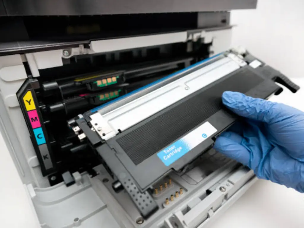
The Role of Quality Consumables in CMYK Printing
You can master the theory, perfect your file setup, and use all the right techniques, but one final element holds the power to make or break your print: the quality of your ink and toner cartridges. Even the most perfectly prepared file will fail if the consumables used to bring it to life are subpar.
This is where a dedicated manufacturer like Toner Master becomes a crucial partner in your creative process. With over 17 years of experience focused exclusively on manufacturing ink and toner cartridges, we understand that color is more than just a code—it’s a science.
When you use inferior, third-party cartridges, you risk a host of problems that undermine your hard work. Inconsistent color mixing can lead to noticeable shifts from your intended design. Poorly formulated inks can produce dull diagrams and text that isn’t sharp. Worse yet, they can cause printer errors or even damage the delicate printing heads, leading to costly repairs.
At Toner Master, we address these pain points directly. Leveraging a modern understanding of color science and cutting-edge technology, we practice strict measurements to ensure our colors translate properly in every single print. Our promise to you is built on three pillars:
- Uncompromising Color Accuracy: Our printer toner and ink are precisely formulated to produce brilliantly colored images and sharp, clear text. We design for maximum resolution, ensuring that the vibrancy you designed on screen is what you get on paper.
- Flawless Compatibility and Reliability: We test our products rigorously to ensure perfect compatibility with your specific printer models from top brands like HP, Canon, Brother, and EPSON. This guarantees stable, error-free operation, allowing you to print page after page with reliable and consistent results.
- Incredible Value: We believe professional-grade quality shouldn’t come with an exorbitant price tag. By focusing on efficient production, we can offer our premium consumables at a fraction of the original brand price, often as low as one-third of the cost. You get OEM-level quality without the OEM-level budget.
When you choose Toner Master, you are not just buying ink; you are investing in peace of mind and the assurance that your creative vision will be realized with precision and brilliance.
Conclusion: Unlock Vibrant Results in Your CMYK Printing Today
This screen-to-paper transition does not need to be a path of compromises and frustrations. It is a voyage of translation, and when you know the language of CMYK printing, you have a key to an ideal solution.
We had an overview of the basics of the subtractive color model, made the necessary distinctions between the digital arena of RGB and the physical world of CMYK, and equipped you with the toolbox essential to succeed in it. You have now seen how to create your files properly, how important it is to have a dedicated black ink, and how to use enhancements such as rich black to give your work that professional touch.
As it turns out, a great print is not only a relationship of your knowledge to what you create, but also to good tools. The combination of adequate file preparation and the best quality, and reliable consumables, using a reputable expert like Toner Master, gives you all the power you need to transition between the screen and the paper. You can now proudly look at your ready print materials and can know that the final work is an honest and vivid representation of what you had initially created in your mind as your own faithful masterpiece, an end product that will indeed show us the exact color you have in mind, and will bring to your imagination the full scope of available colors that the CMYK printing color gamut can display.